CASE STUDY
The Forge at Atlantic Yards
The Forge at Atlantic Yards is the latest office project in the over 500,000-square-foot Atlantic Yards development by Hines and Invesco Real Estate, located in the bustling and vibrant neighborhood of Midtown, Atlanta.
Together with my colleagues at Torque, we began with a discovery workshop with all stakeholders, leading us to define 5 core concepts: evolution, authenticity, connectedness, cohesion, and proximity.
We then began to name the building, ultimately selecting ‘The Forge’, a name that ties into Atlanta’s industrious heritage of creating great and enduring items through hard work — evoking fiery energy, sparks, and brightness.
To create a brand that connects with the local history, aligns with the core concepts, and carries the development boldly into the future, we established a round seal / stamp design that evokes an iron brand mark, with the colors of classic materials: gold, rust, and dark wood.

The logo in full color, debossed on paper
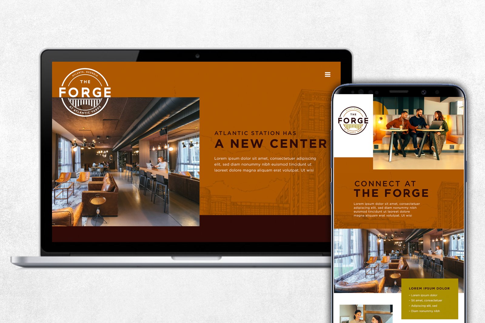
A mockup of potential web and email designs in the new brand

We delivered an 8-page logo standards guide, defining the color palette, typography, and usage guidelines for the new brand

The logo 'forged' in iron
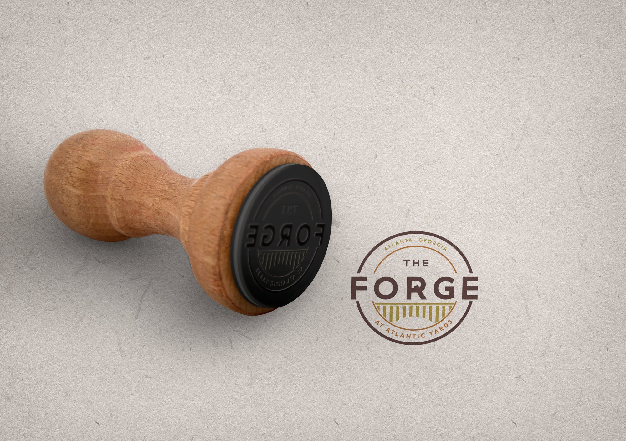
The seal or stamp aspect of the logo harkens back to the site's handcrafted history.

We proposed the tote bag as a potential gift for new tenants of The Forge.

Previous iterations of the logo, based upon a client-provided architectural drawing in a historical sketch style

Initial logo design options proposed, ultimately rejected